01. brand refresh
AINTREE FOOD & WINE CO.
marketing
digital design
brand identity
social media
marketing
digital design
brand identity
social media
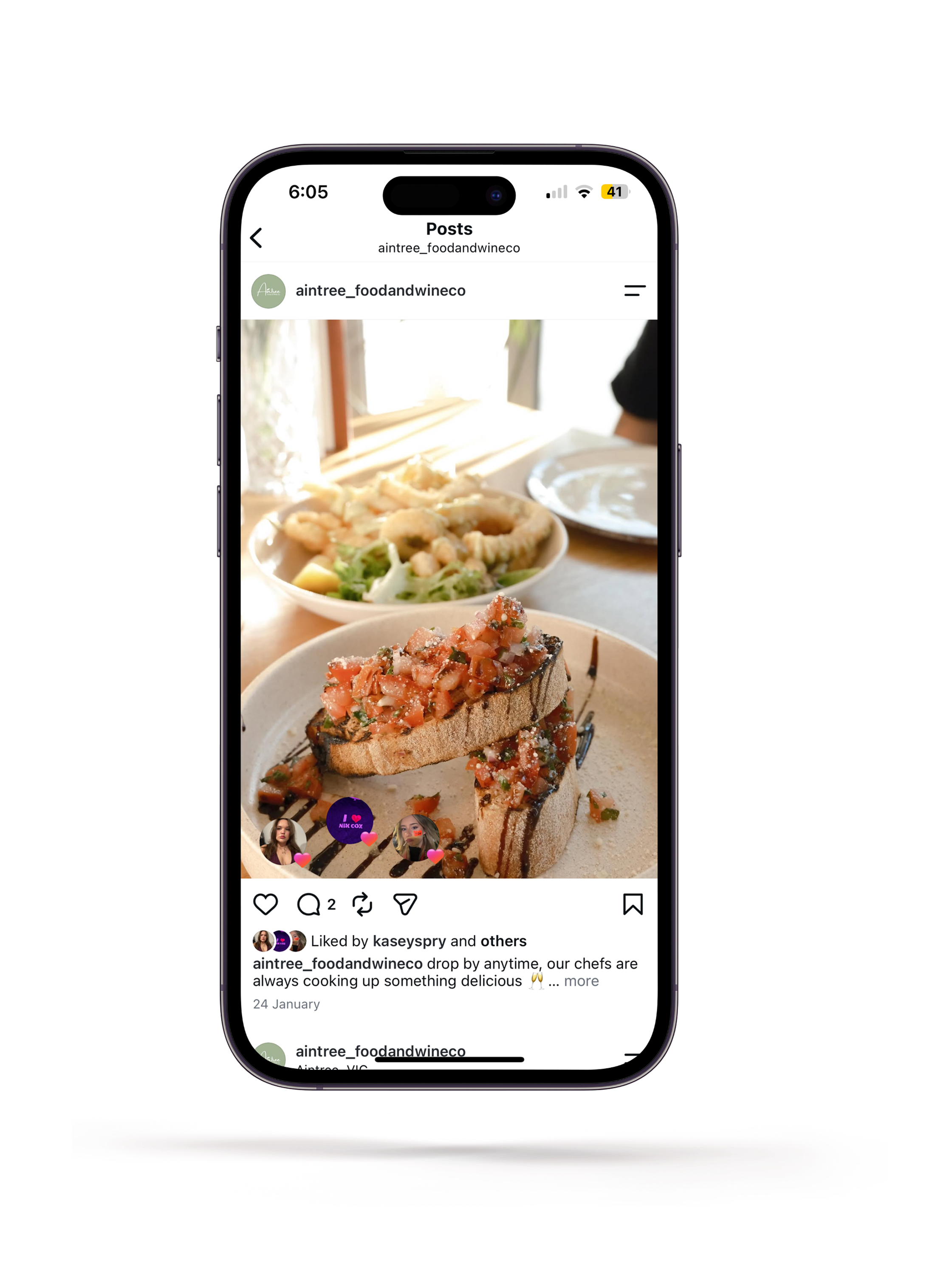
In January 2026, I was tasked with redesigning the social media presence and brand style guide for Aintree Food & Wine Co, a European style restaurant located in Melbourne's west.
The project involved refreshing the visual identity across digital platforms while managing ongoing content creation, scheduling, customer engagement, and promotional campaigns.
The primary objective was to create a more cohesive and engaging online presence that accurately reflected the restaurant’s warm and welcoming atmosphere while improving audience reach and customer interaction.
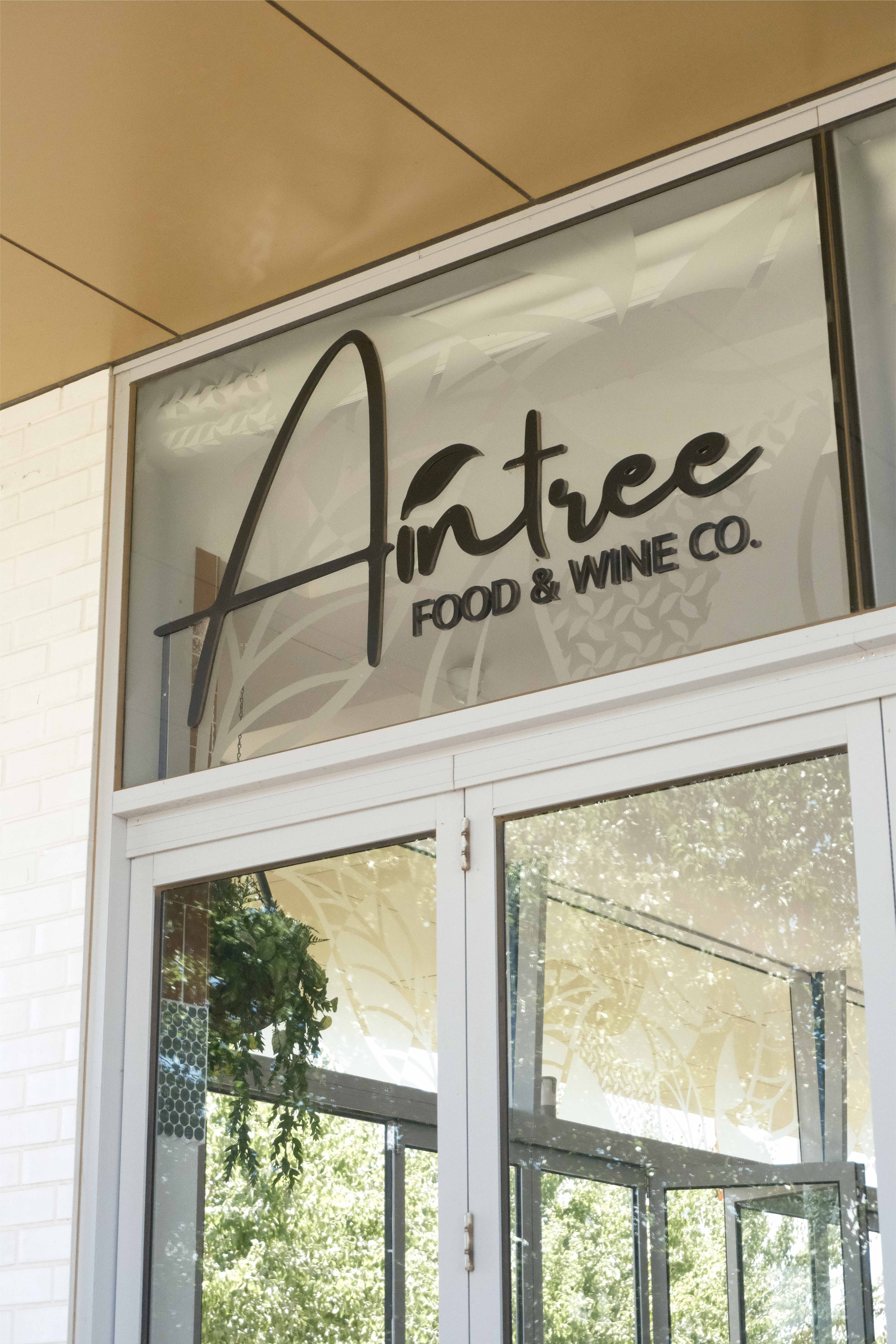
A key focus of the redesign was aligning the social media presence with the restaurant’s personality and customer experience.
While the existing content was relevant, it lacked consistency and did not effectively communicate the friendly, open, and inviting atmosphere of the venue. The previous visual direction relied heavily on dark colour palettes and low-quality imagery, which created a disconnected and unappealing online experience. Typography choices, although elegant, reduced readability, particularly for the restaurant’s large senior customer base.
To address these issues, I developed a refreshed visual approach centred around developing a new colour palette, curated typefaces and photography style.
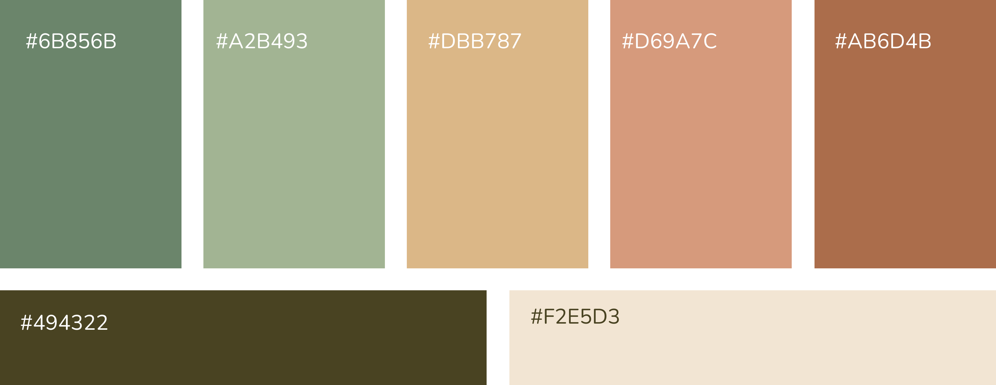
This updated colour palette reflects the restaurant’s personality significantly better than the previous. I’ve kept in theme with green and terracotta as those colours are used in the restaurant’s physical interior but changed the tones to be warmer and friendlier. As well I added a mustard yellow to be one of the primary colours to brighten the palette.

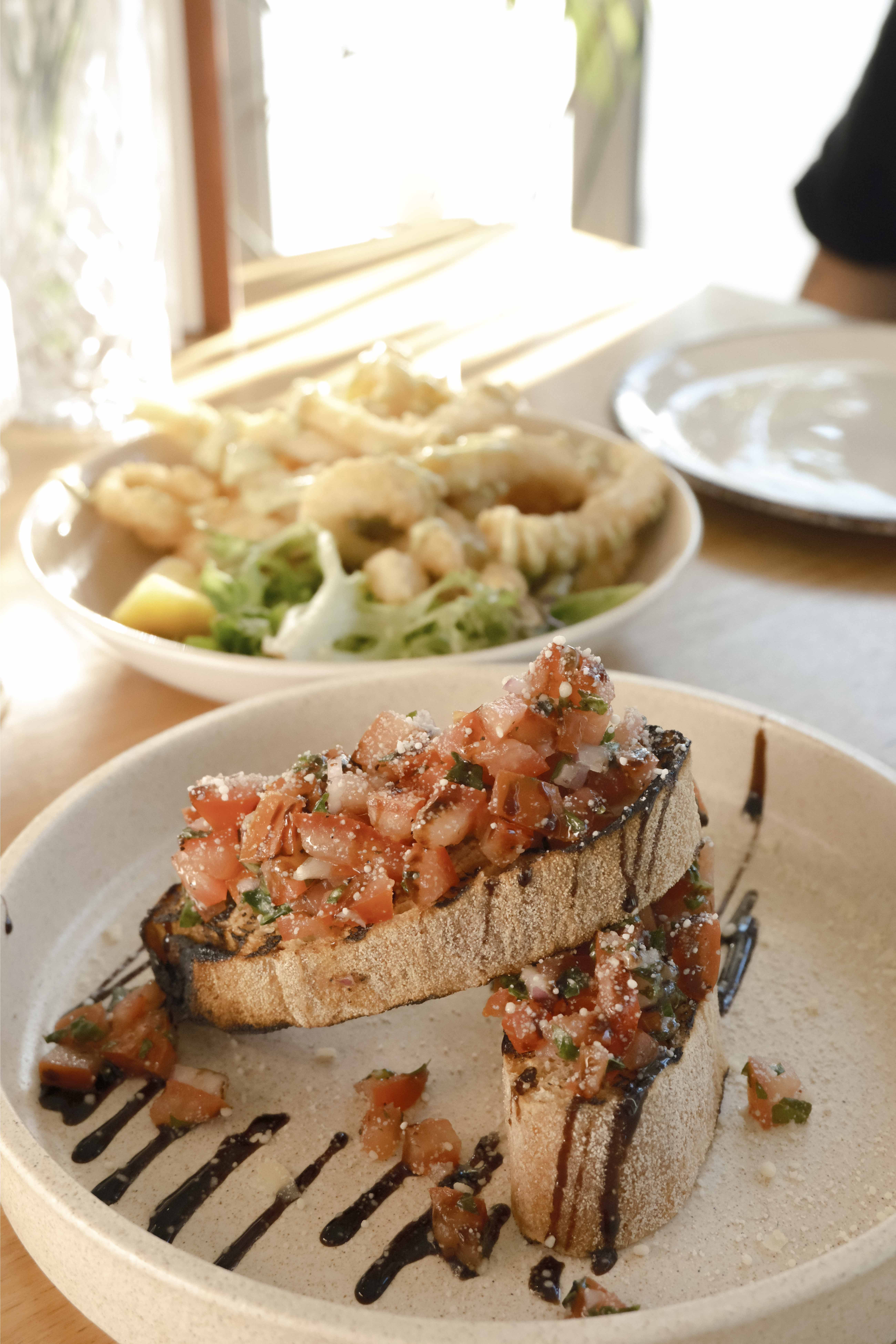
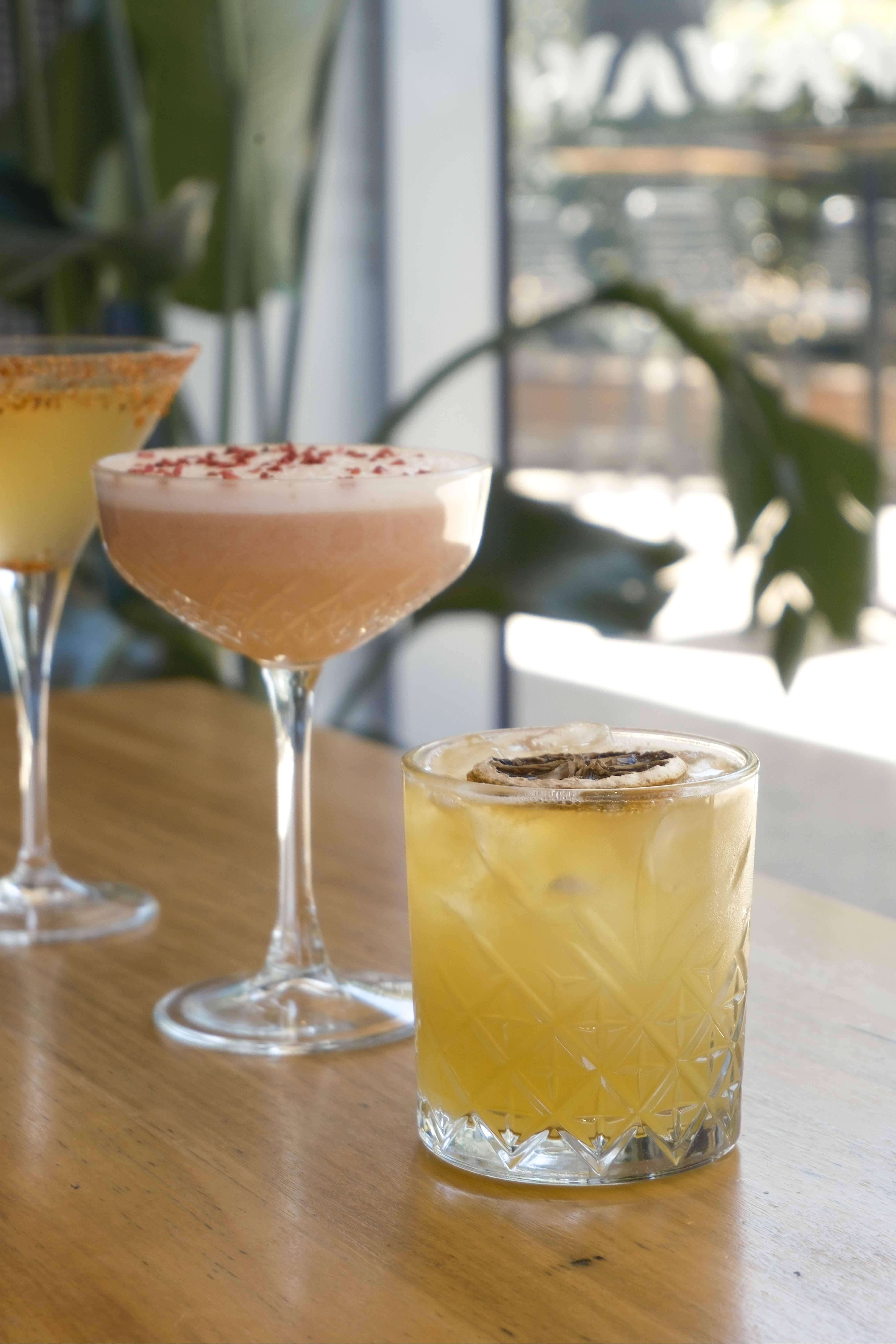
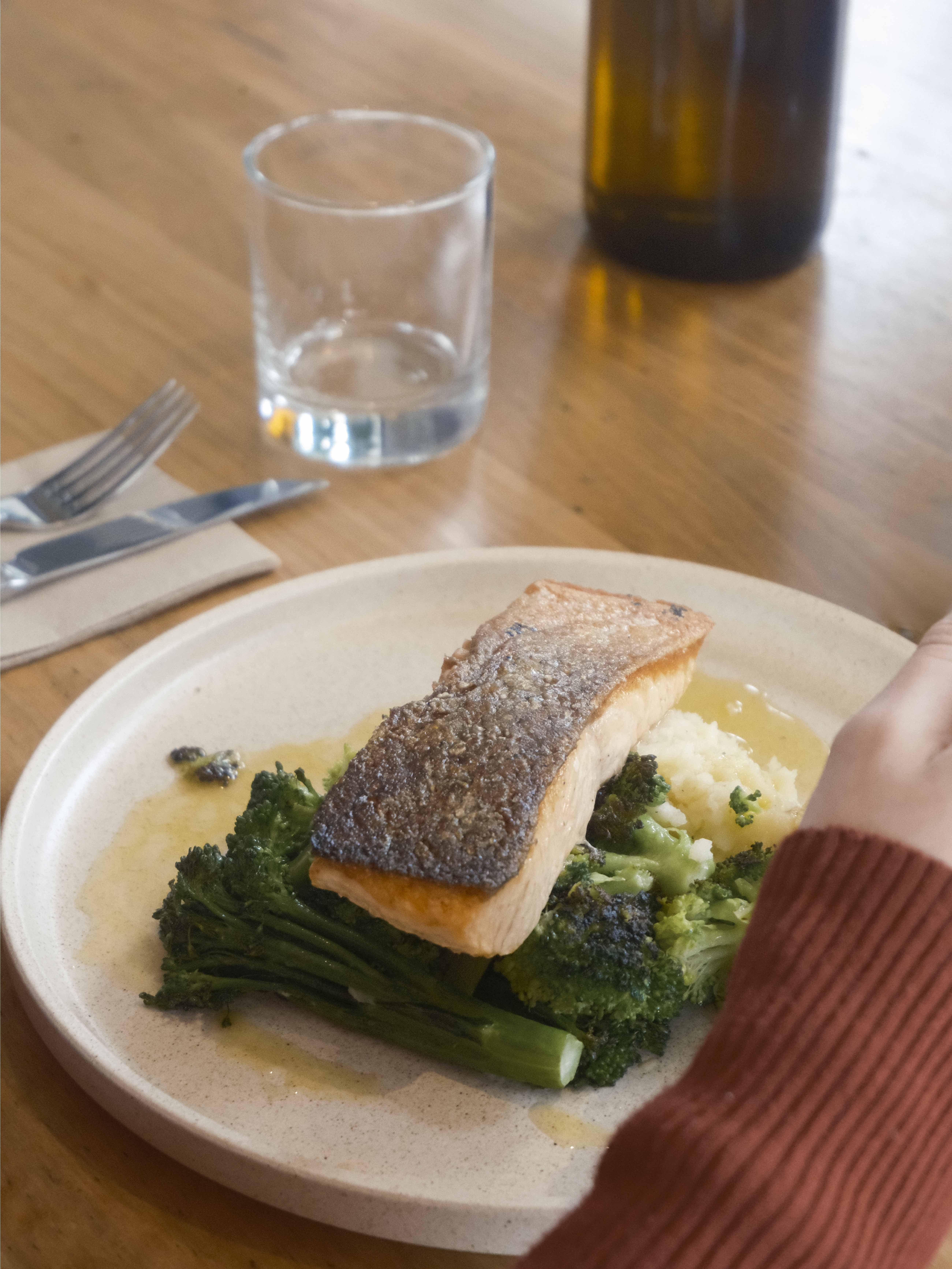
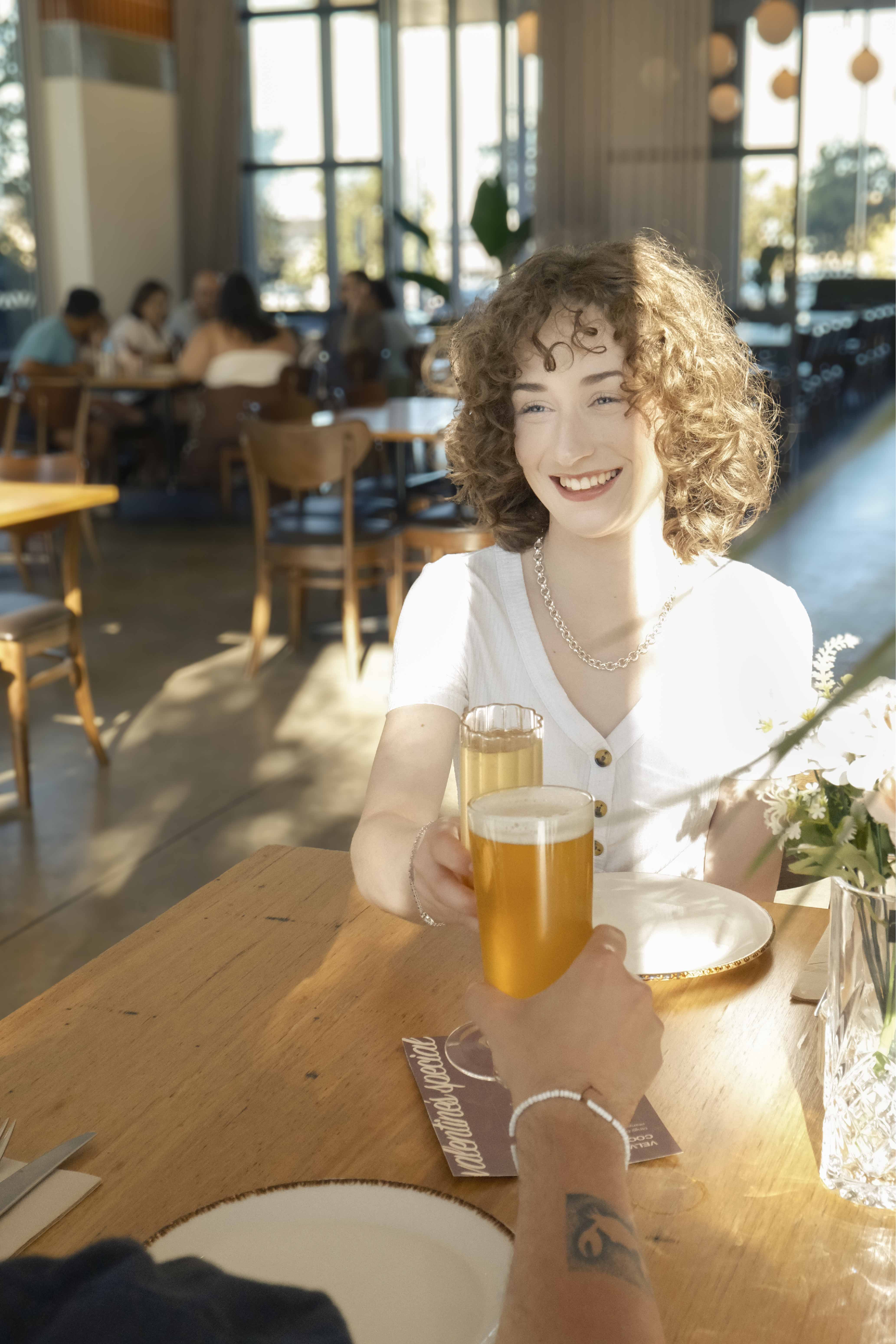
The subject matter ranges from menu highlights, customer experience and the architecture. The feed should showcase popular meals, drinks as well as the staff to create a strong and trustworthy relationship with the audience.
The goal is to create a visual experience for the user so they can envision if they were to visit the restaurant. In order to create a cohesive feed the photos will be edited in a similar style. This includes warm tones and cool highlights enhancing strong natural lighting allowing for dynamic imagery.
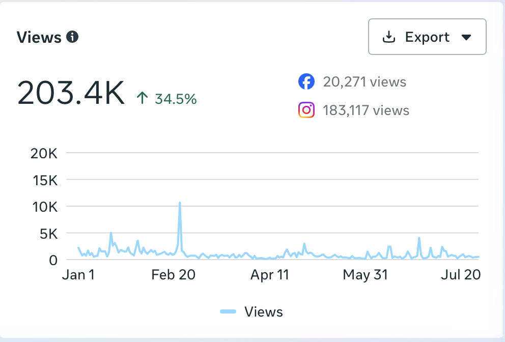
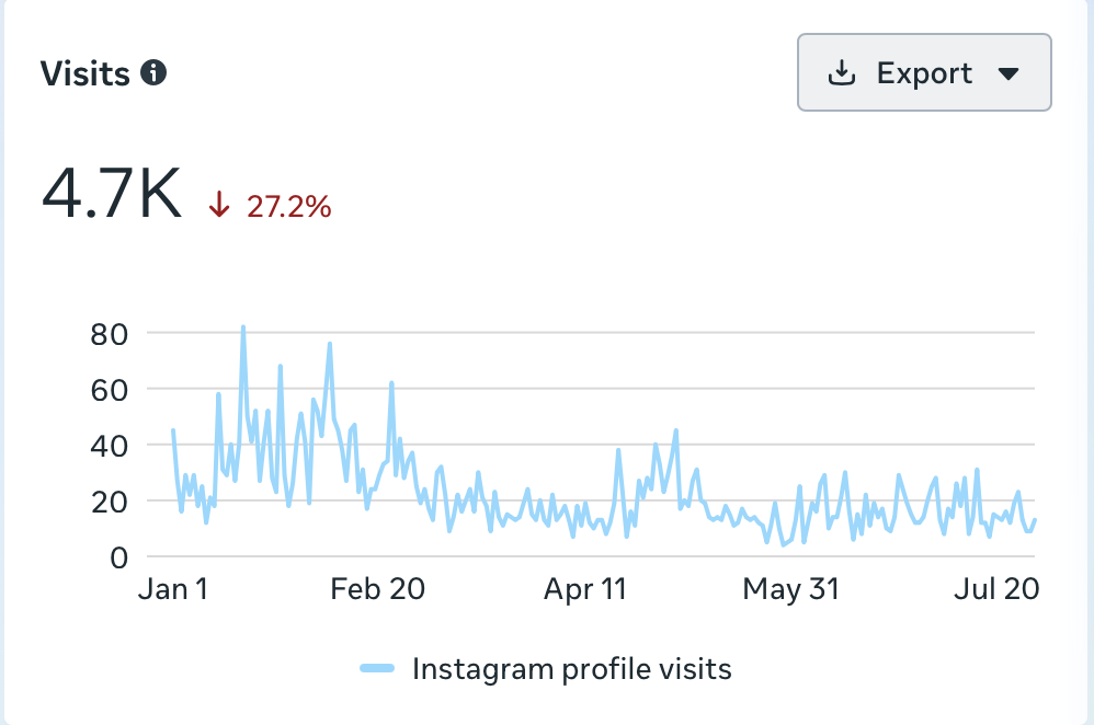
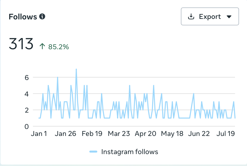
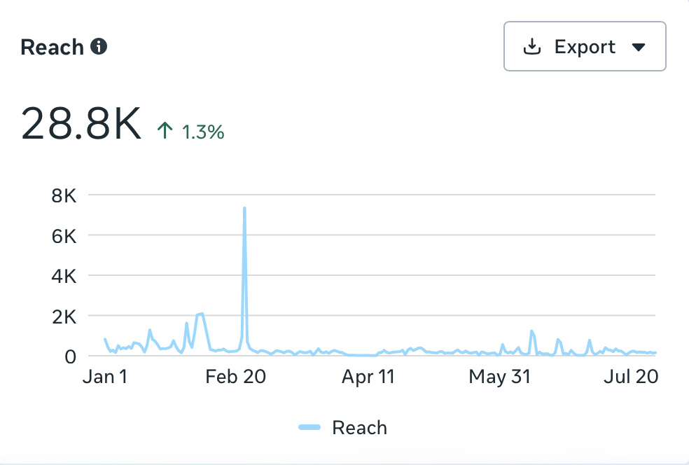
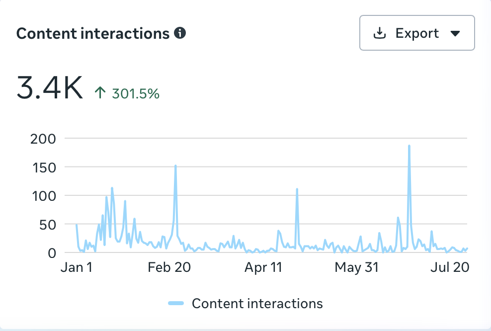
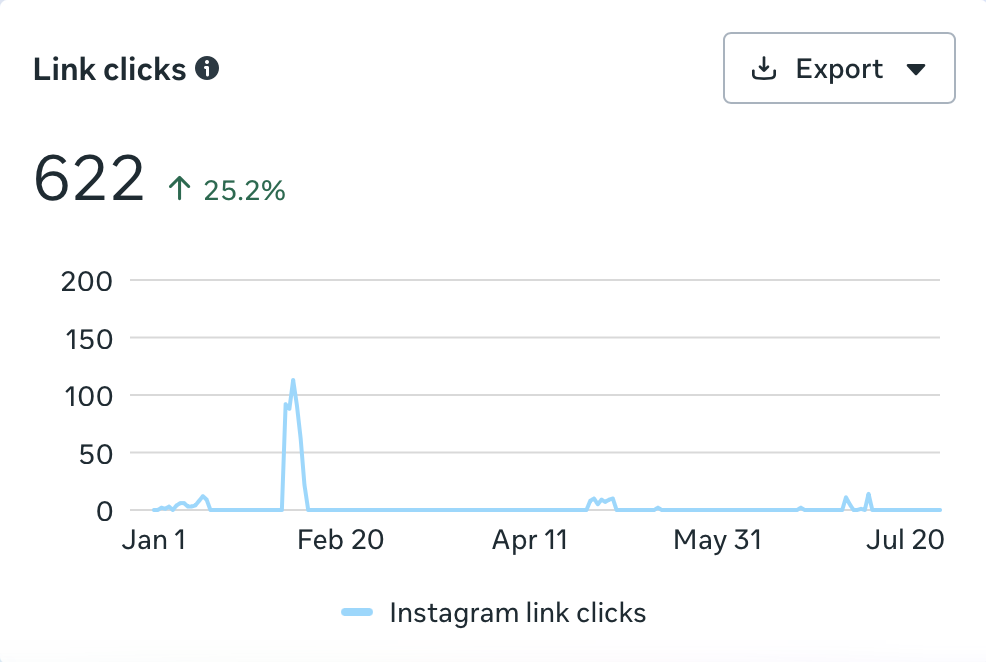
Overall there has been strong engagement across social media platforms from January 1st to July 31st, with Instagram performing the best.
Although there are areas that have not improved yet, it is clear that the new content is more engaging as the content interactions have increased by 301.5%. The increase in views has helped contribute to this with an increase of 34.5%.
From these insights I can conclude that conversion is the main area that needs to be focused on going forward in terms of driving the audience to visit our profile, follow our accounts and visit our website.

2026 megan warren